Reference
Brand Guide
Everything that keeps Wrights Grove looking and sounding like Wrights Grove. Share this with designers, sign vendors, printers, and anyone helping us communicate.
01 · Brand Essence
Who we are
Wrights Grove Baptist Church is a community of believers grounded in scripture and shaped by service. We are a working church — neighbors who show up, hands that build, voices that praise. Our brand should sound and feel like the church does on a Sunday morning: warm, unhurried, and honest.
What we stand for
Faith over flash
We don't chase trends. The cross on our logo is the same cross that's been on our wall for generations. Our visual identity should feel rooted, not branded.
Welcome before instruction
First-time visitors and lifelong members both deserve to feel at home. Every piece of communication — from a sign to a newsletter — should make someone feel invited, not lectured.
Plain speech
We write the way we'd talk to a neighbor on the porch. No jargon. No corporate church-speak. If a child can understand it, we've done it right.
Service is the point
Six ministries, a printed newsletter every Sunday, a YouTube channel, and dozens of volunteers — we are a church of doers. Our communications should reflect that quiet competence.
02 · Visual Identity
The logo
Our logo pairs a hand-drawn cross with the church name set in two voices — a steady serif and a flowing script — anchored by the words "Baptist Church." Together they speak to who we are: rooted but warm, traditional but personal.
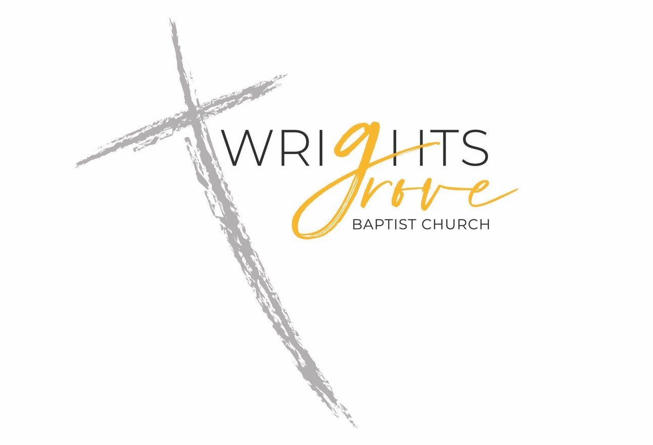
Primary logo — full color on white
Logo usage
- Always preserve the original proportions. Never stretch, squish, or rotate.
- Maintain clear space equal to the height of the word "BAPTIST" on all sides.
- Minimum size: 1 inch wide for print, 120 pixels wide for digital.
- Use on white or cream backgrounds whenever possible.
- Do not place the logo over busy photography. If a photo background is unavoidable, place it on a solid color block.
03 · Visual Identity
Color palette
Grove Gold
Primary accent. Use for headlines, dividers, and key emphasis. Sparingly — it should feel like sunlight, not paint.
Cross Charcoal
Primary text color. Used for body copy, headings, and the logotype. Pure black is too harsh; charcoal carries the same gravity with more warmth.
Sanctuary Cream
Background tint for forms, callouts, and printed pieces. Adds warmth without competing with the gold.
Soft Stone
Secondary text. Captions, dates, subheadings, and supportive copy that shouldn't compete with the main message.
Typography
Type system
Our typography is intentionally simple. The logo carries the personality; the body type should disappear into readability.
Primary Typeface
Calibri
Universal availability. Works on every computer, phone, and printer without installation. Use Calibri Bold for headings and Calibri Regular for body copy.
Professional Alternative
Source Sans Pro
For designers and vendors working on materials in Adobe or other professional tools — Source Sans Pro is free, open-source, and reads similarly to Calibri at larger sizes.
04 · Verbal Identity
Voice & Tone
How Wrights Grove sounds in writing — whether it's a Sunday newsletter, a Facebook post, a contact form auto-reply, or a sign on the door.
Our voice
Warm, not slick
We are a neighborhood church, not a marketing campaign. Our writing should feel like a real person wrote it.
Direct, not stiff
Short sentences. Active voice. Say what you mean. "Bible study meets Wednesday at 7" beats "please be advised that Bible study will commence on Wednesday evenings at the appointed hour of 7:00 PM."
Inviting, not pushy
We open the door. We don't drag anyone through it. Use "you're welcome to join us" rather than "don't miss this opportunity."
Reverent, not stuffy
Scripture, theology, and sacred topics are handled with care. But that doesn't mean every sentence needs to sound like the King James Version.
In practice
When in doubt, write the way you'd talk to a neighbor on the porch.